Hubertusstr. 23, 82131 Gauting
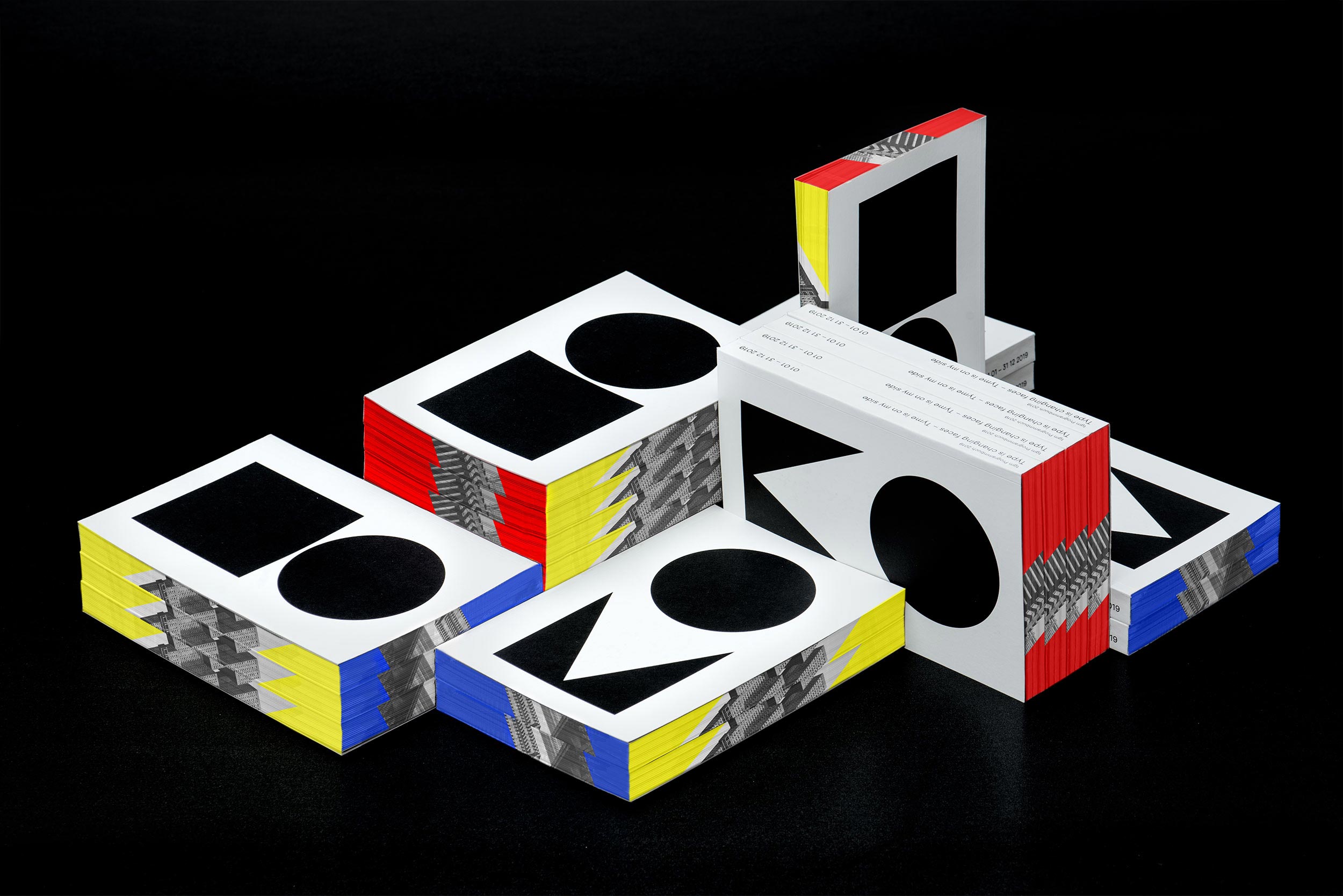
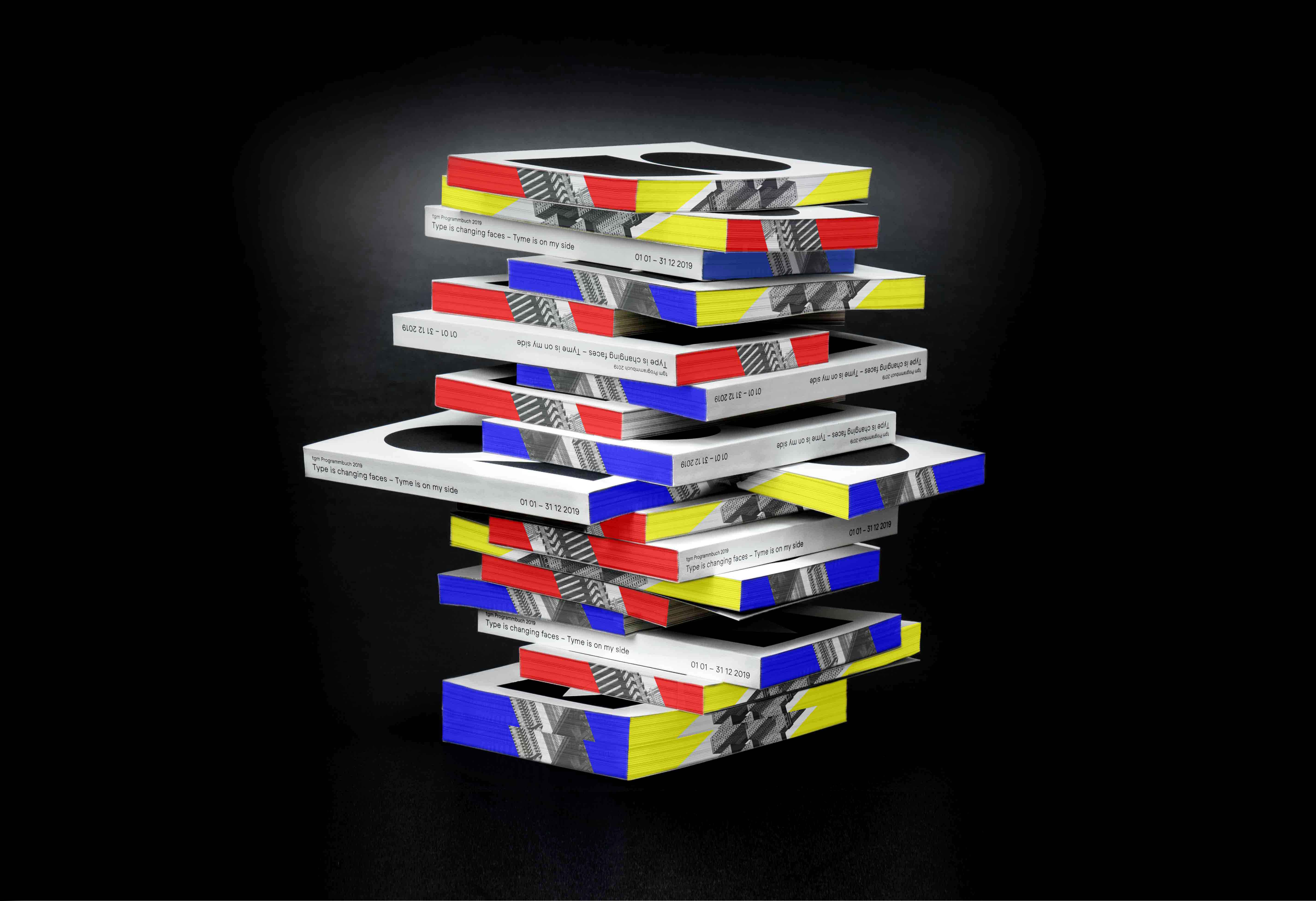
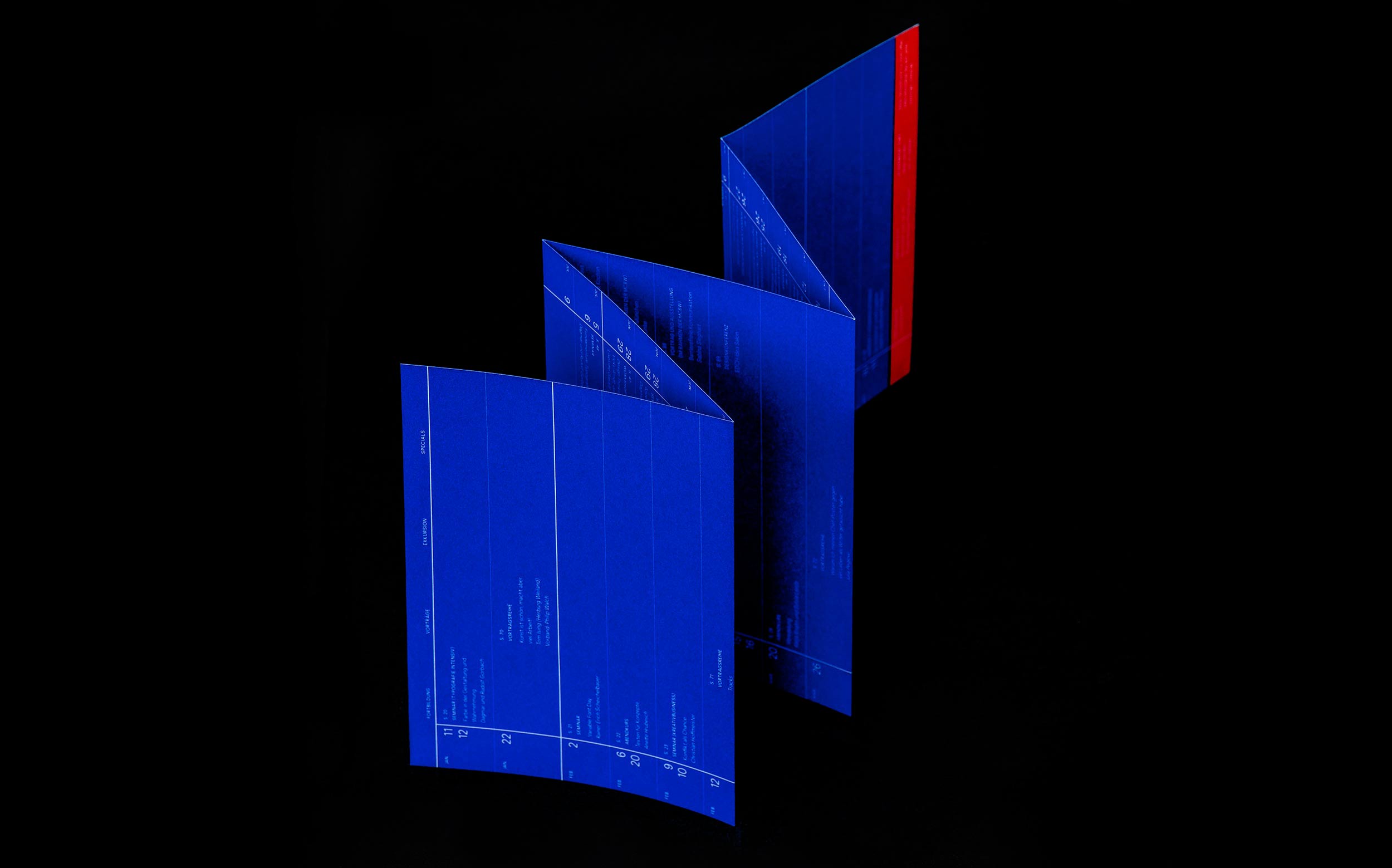
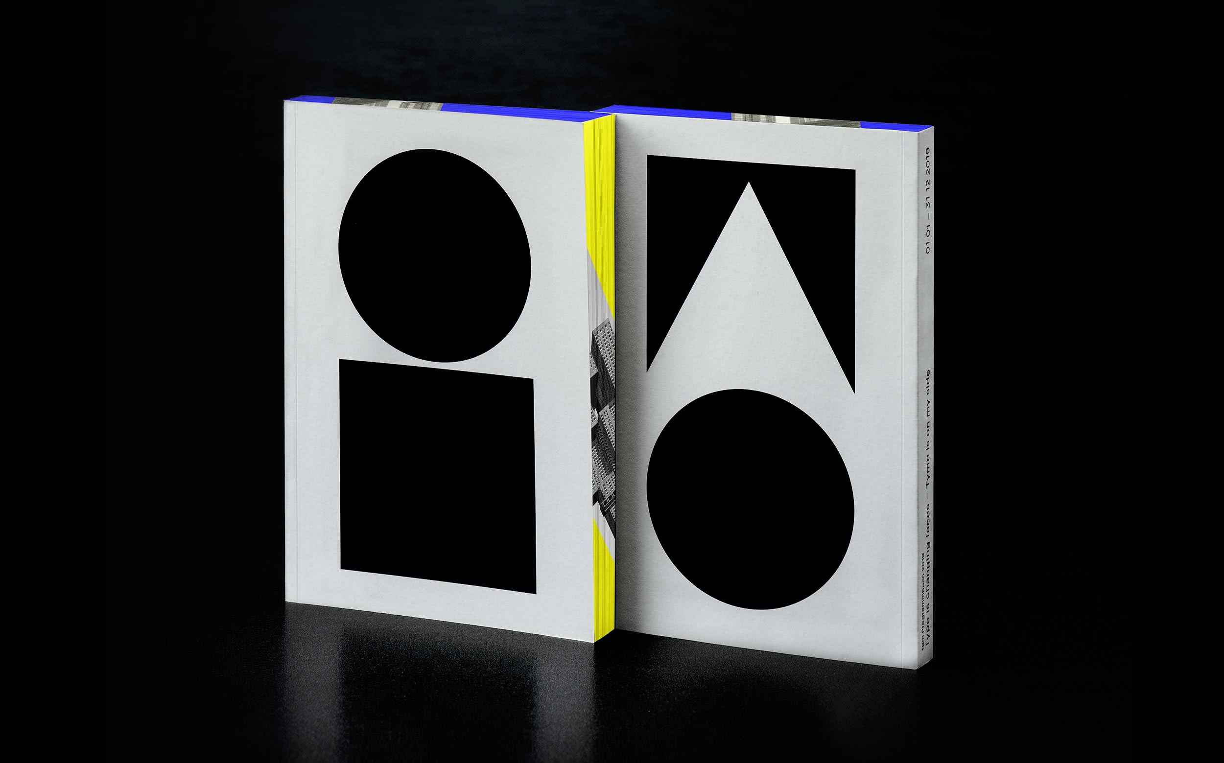
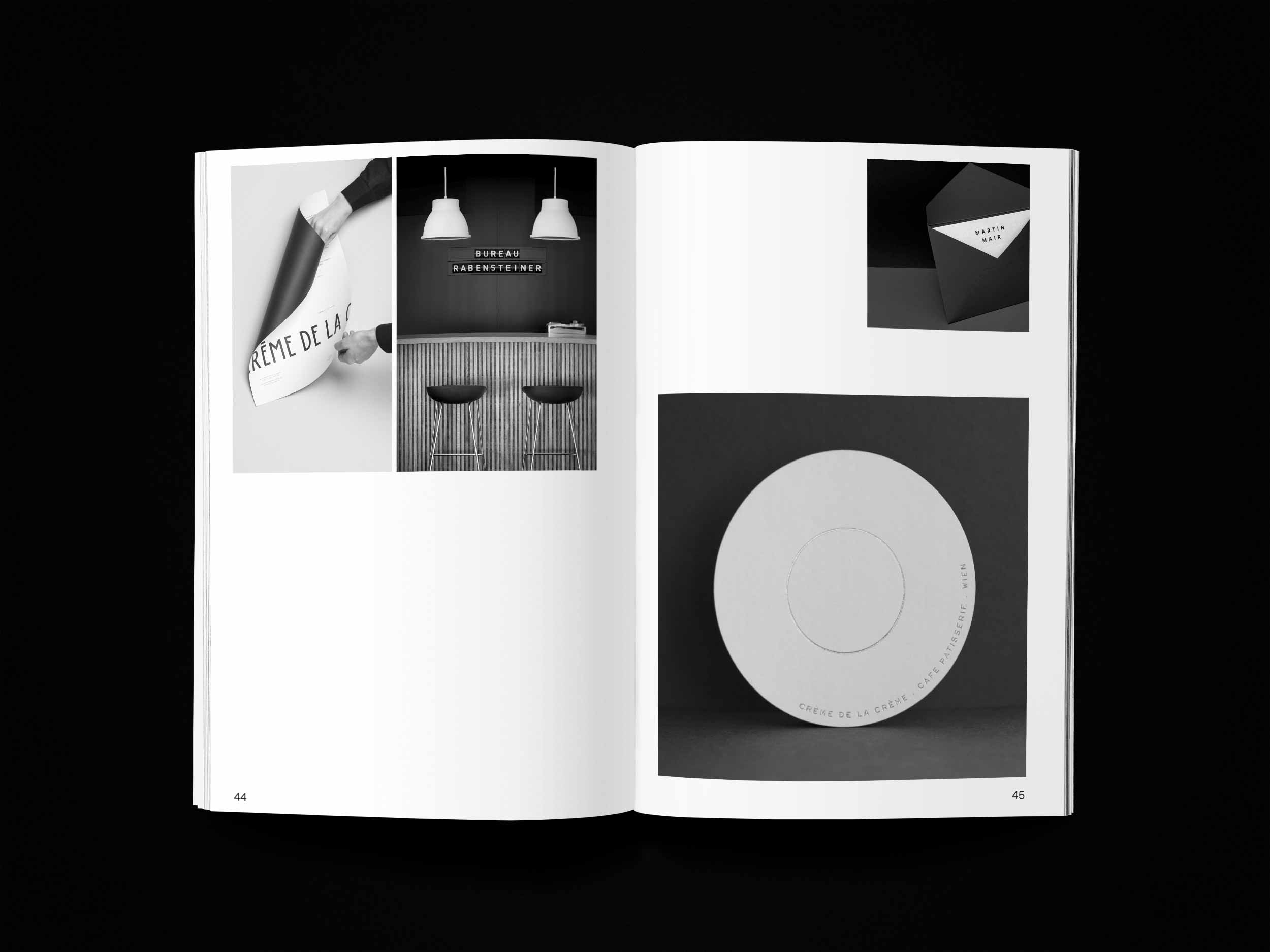
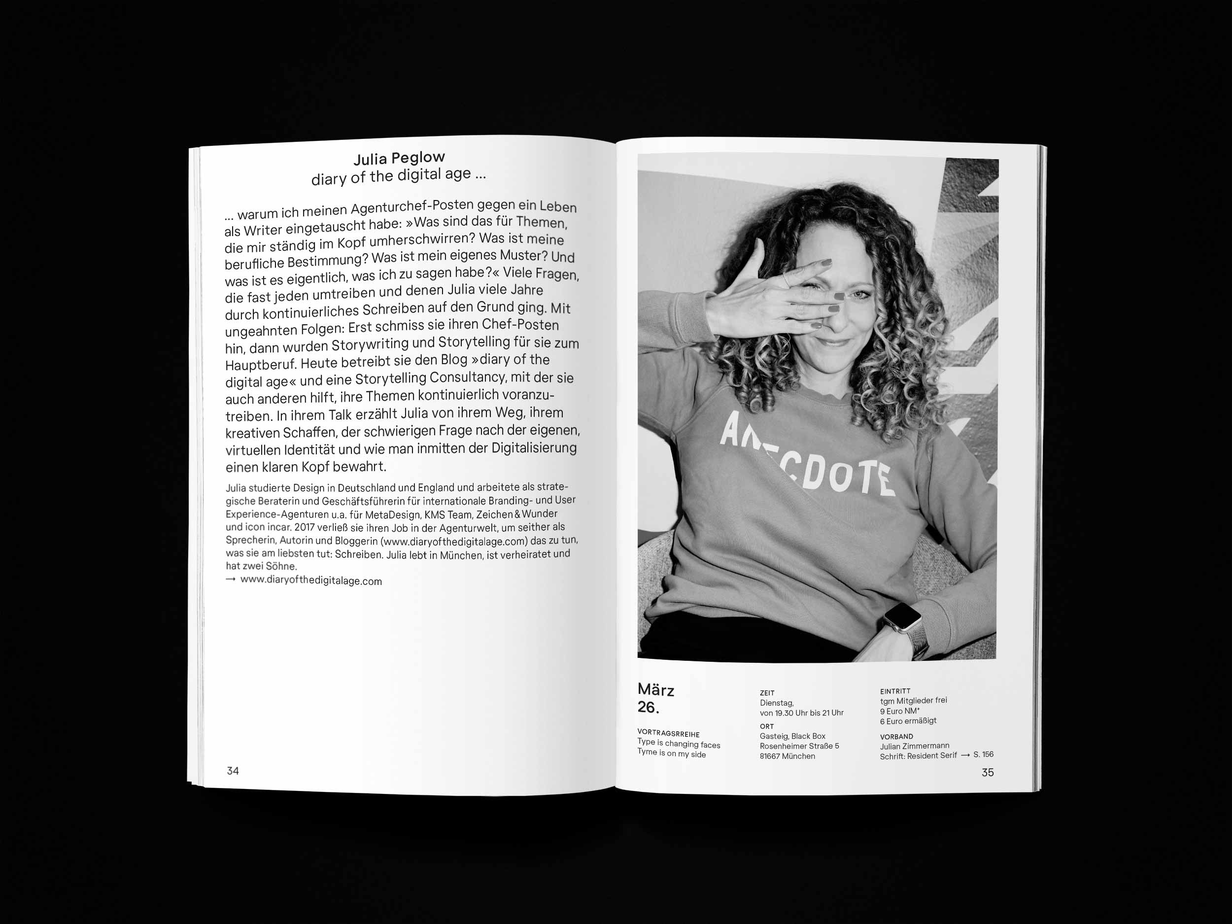
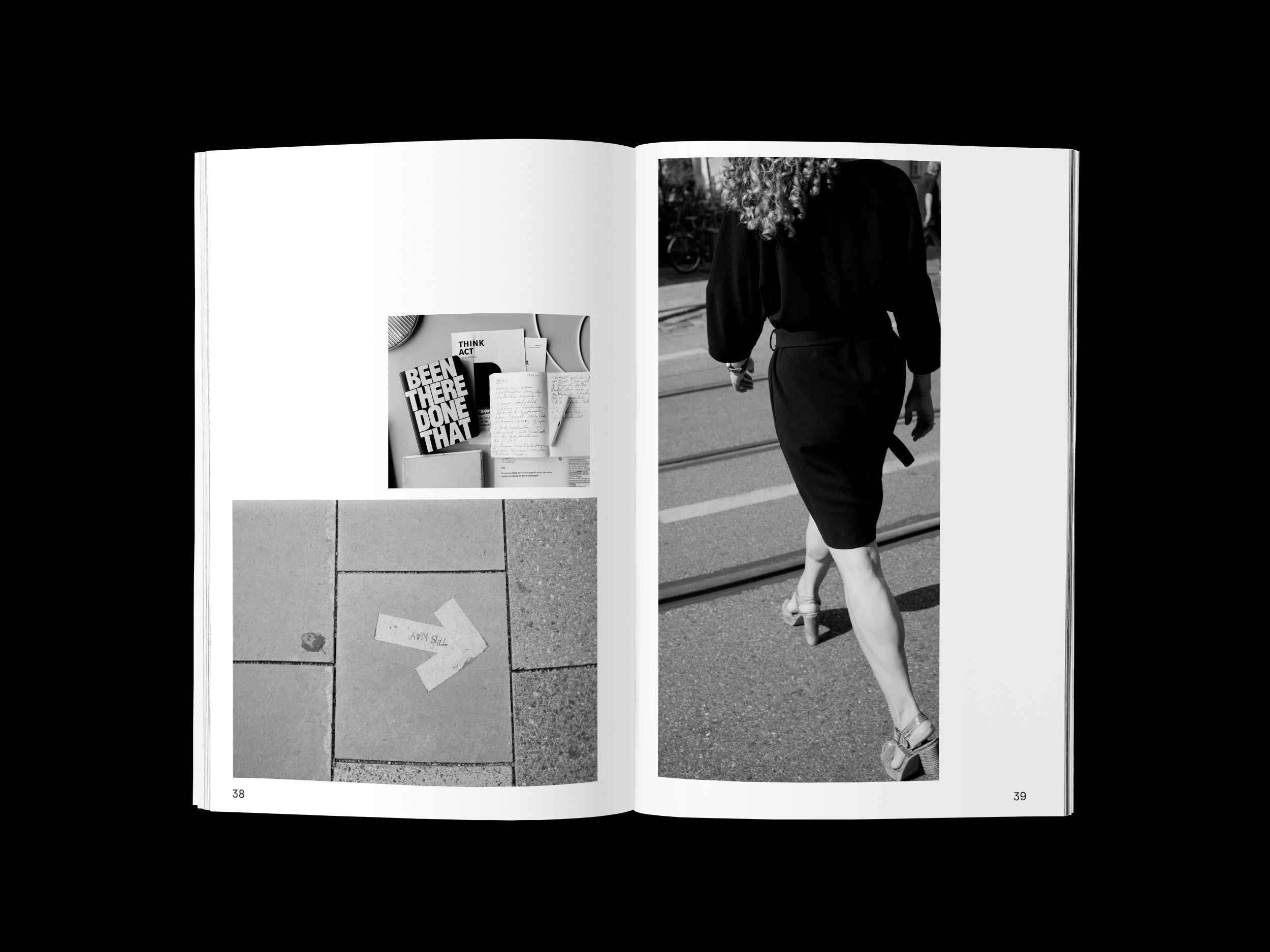
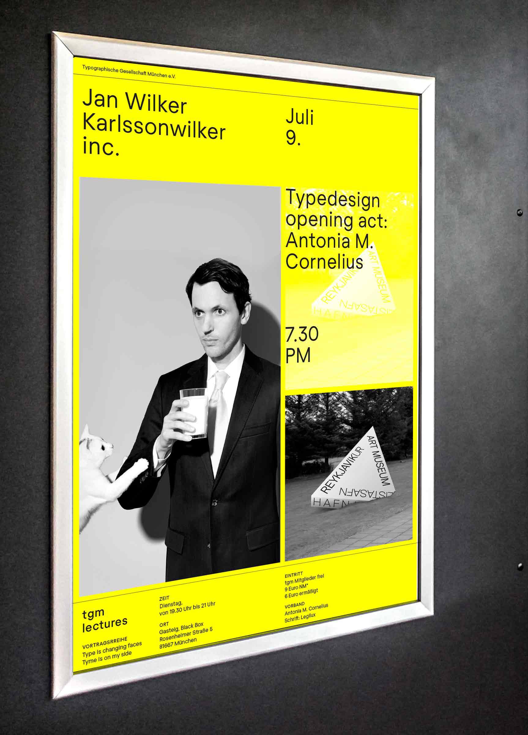
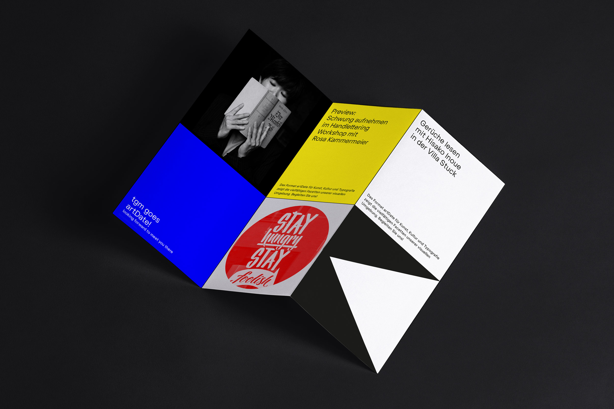
The tgm was founded in 1890 by printers and type setters and it was born into a time of upheaval in many areas of life. During the last few years, it evolved into a design orientated association with an interdisciplinary way of thinking, and a growing range of courses to match it. This resulted in an extensive and diverse network of designers, typographers, photographers, advertisers and many more; with the goal to further the education of its members and to not only use typography, but above all to discuss it! We talk about how to (typographically) debate in the future at conferences such as EDCH and the Dynamic Font Day. As Chairwoman of the association I curated several lecture series in the past years, inviting design and typography celebrities. Throughout the years designers auch as Stefan Sagmeister, Mirko Borsche, Eike König, Mario Lombardo, Sascha Lobe, Paula Scher or Kurt Weidemann – to name a few – followed these invitations and appreciated the warm welcome of our community.
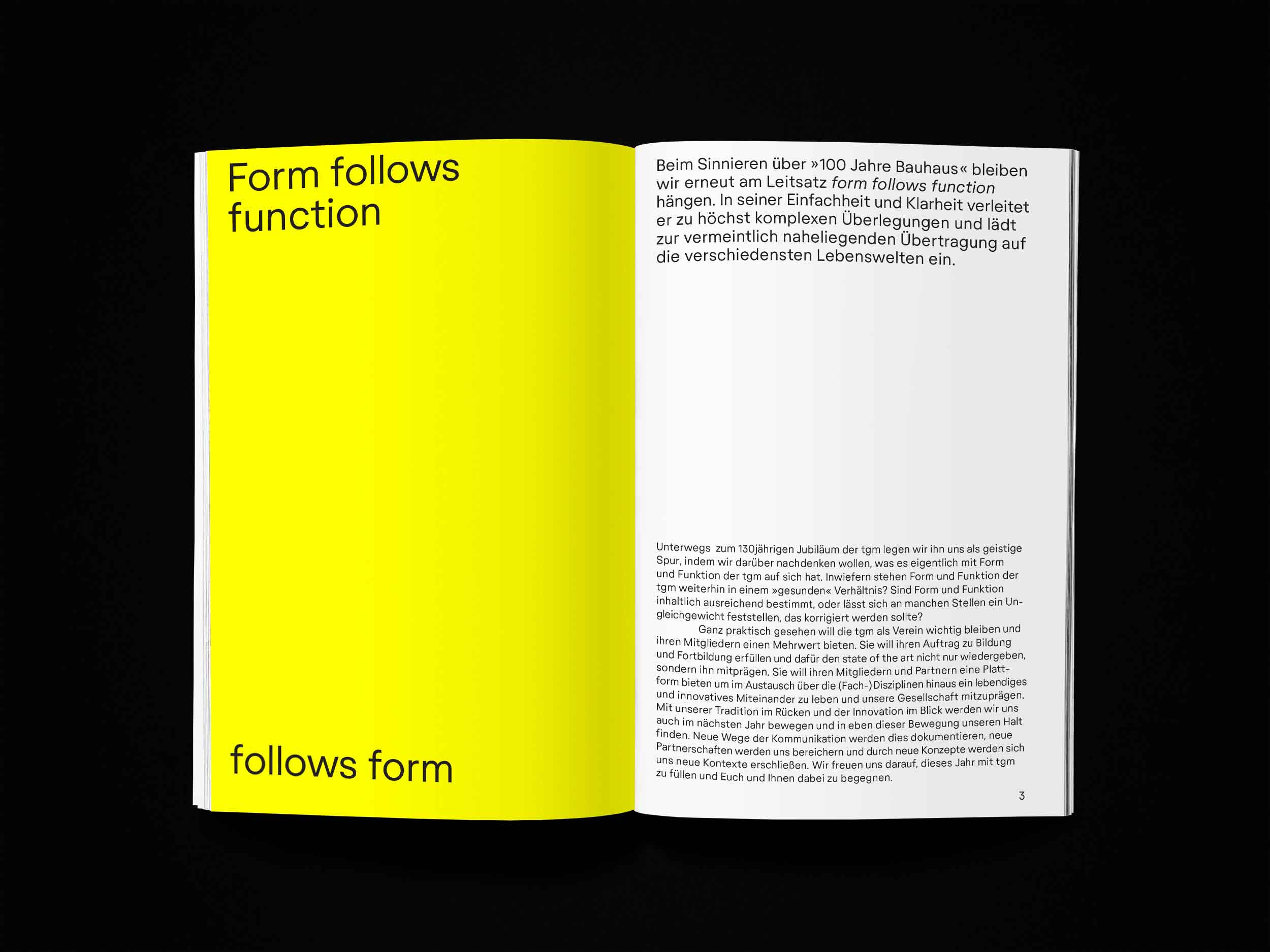
In accordance with the traditional willingness to innovate and our innovative view of tradition the tgm is picking up the central elements and essential ideas of the Bauhaus in this anniversary year. And we apply them to the »architecture« of the tgm, for example by asking: Are form and function of the tgm in a healthy balance? Are form and function in content sufficiently defined, or is there an imbalance that needs evening out?
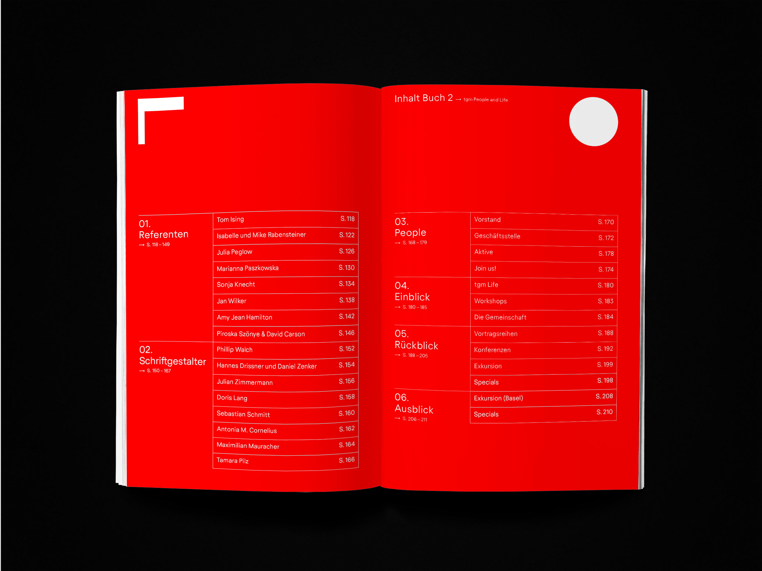
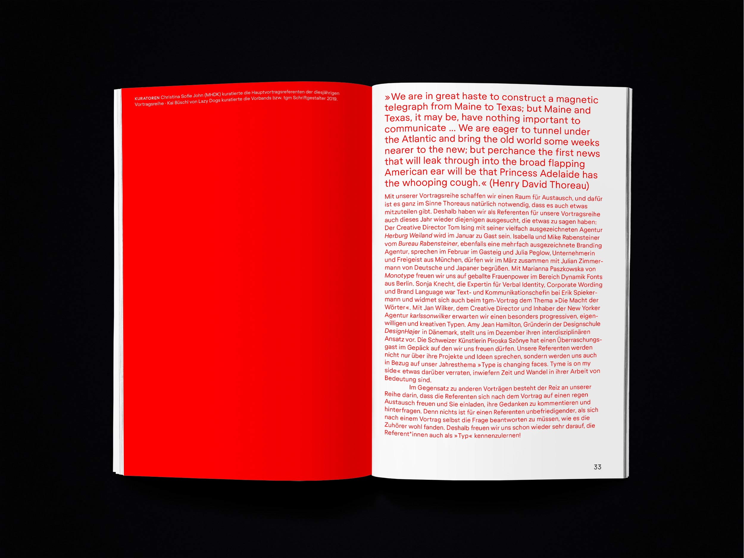
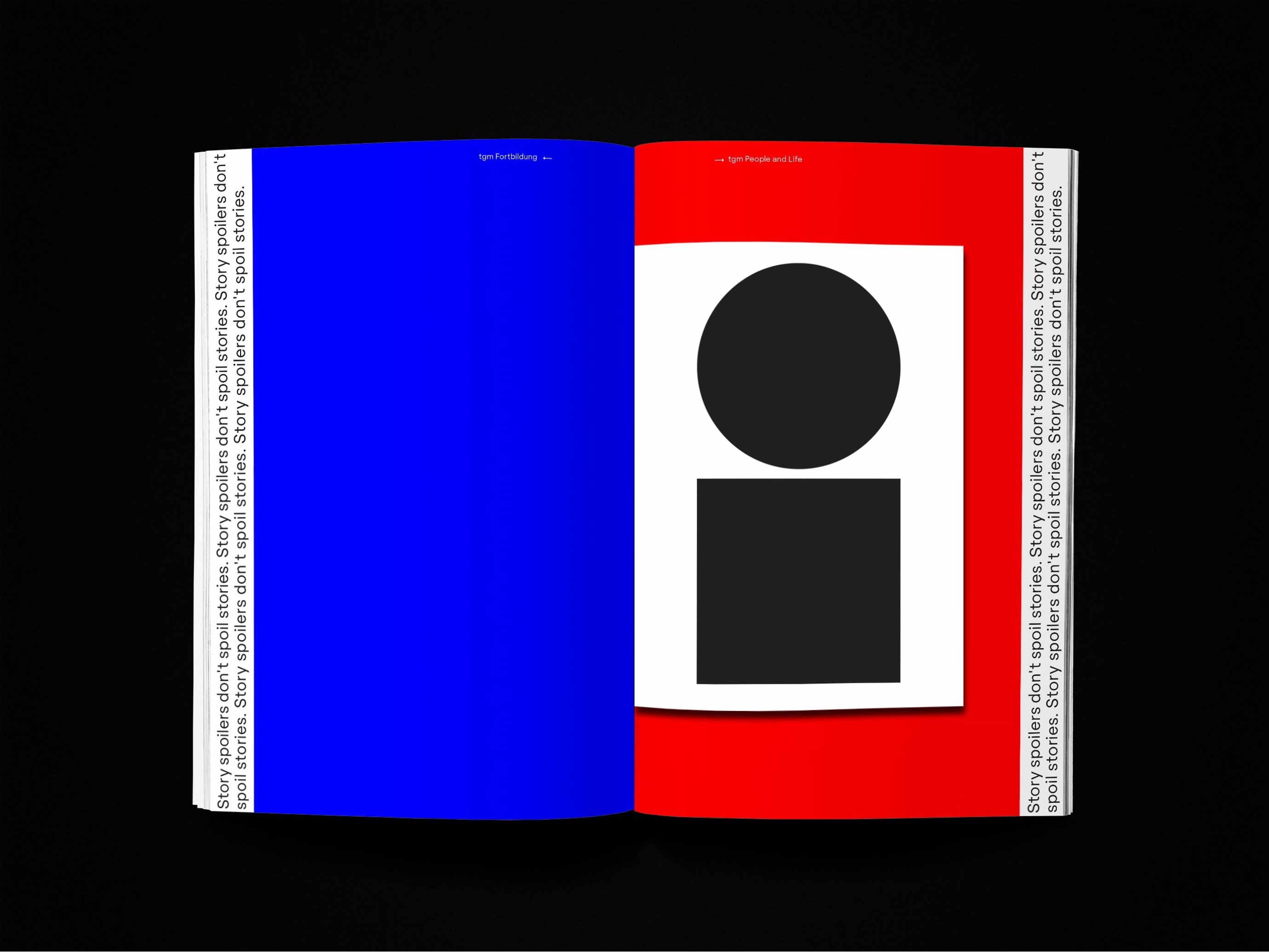
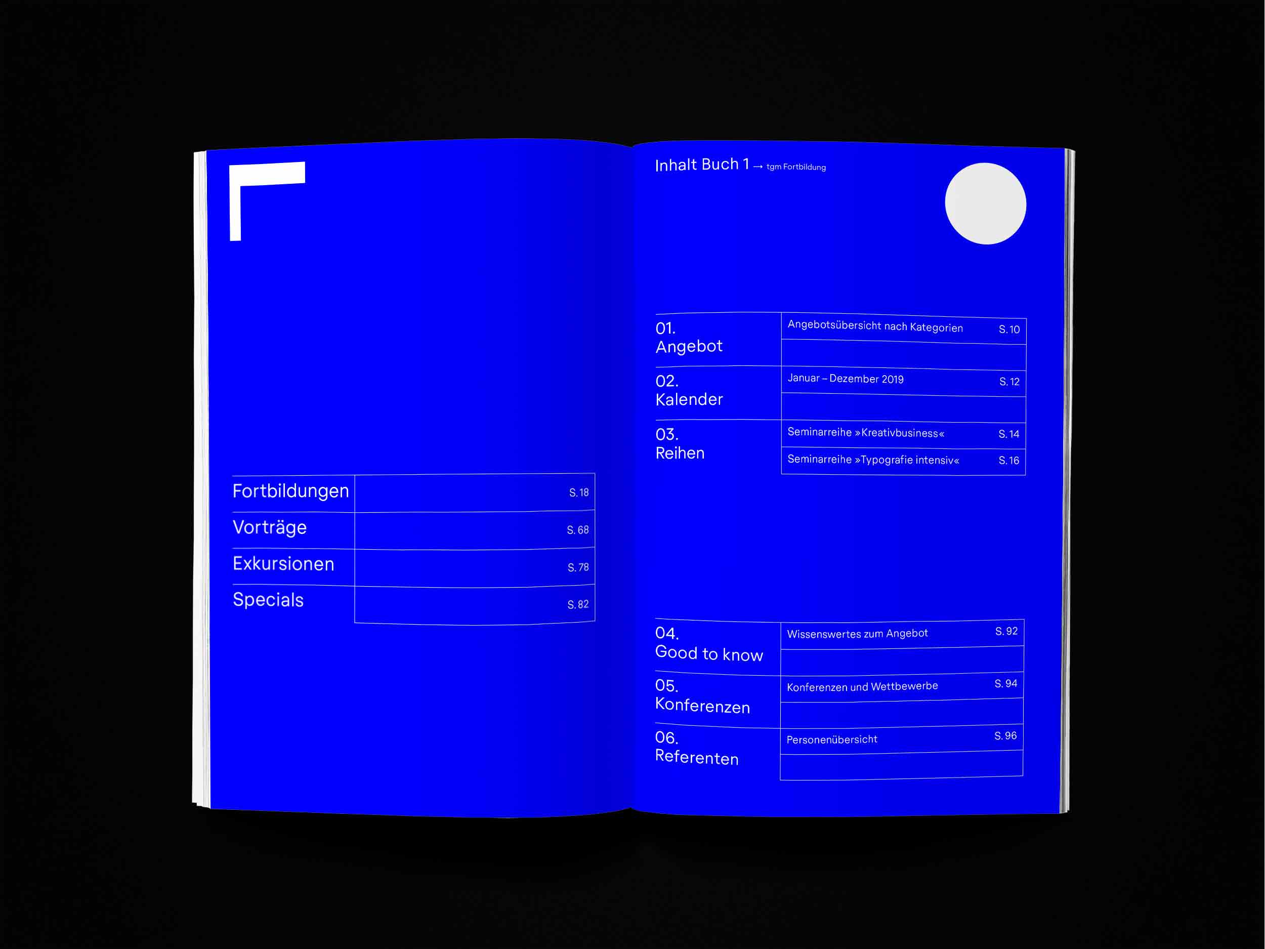
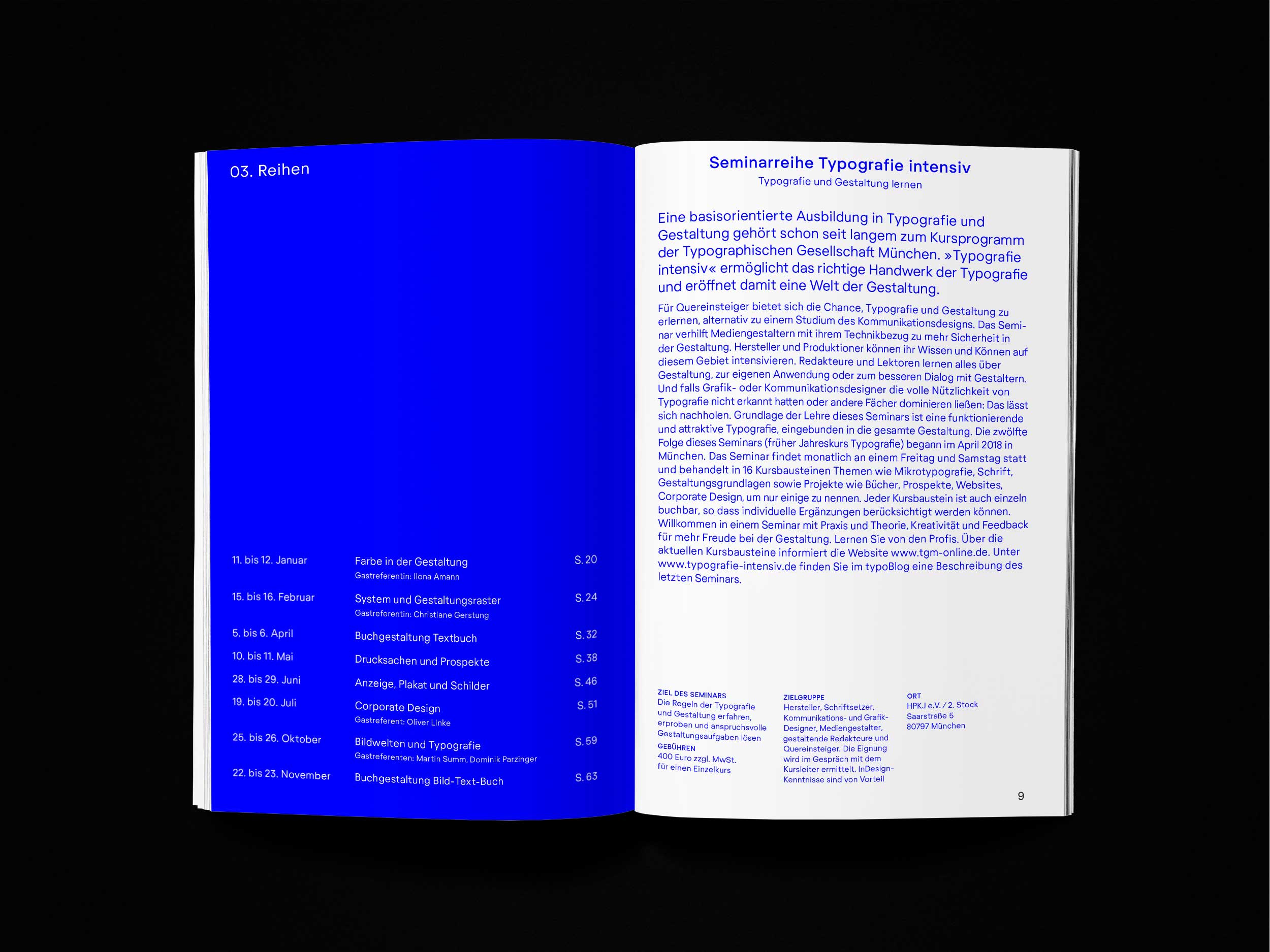
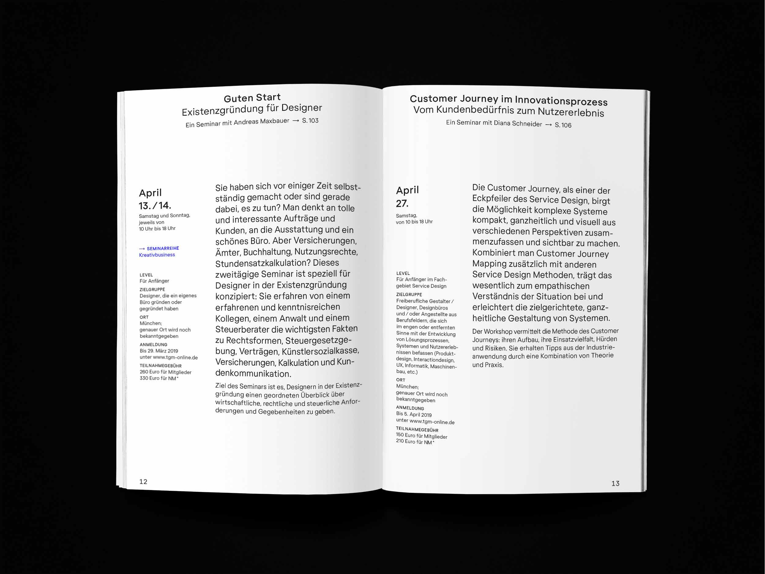
In the tgm annual yearbook the different aspects of out self-perception are assigned primary colours. The educational programme is presented in blue. The events (conferences, trips, presentation etc.) and the people on and behind the stage are shown in red, and the yellow notebook in the the middle separating the two topics is an invitation to participate. This strict and simplistic composition is not accidental, but an expression of the impression MHDK wants to make; furthermore it indicates the (colour) system of the tgm’s new website. These changes in and through our time are taken into account and prepared for the future in the tgm annual theme:Type is changing faces. Tyme is on my side.
Every offer under the roof of tgm is a result of solidarity. It is a result of people and companies who are united by the common interest in typographic quality. This project has only been possible with the support of Gotteswinter und Aumaier, Papier Union, Conzella Verlagsbuchbinderei, Richard Mayer Buchbindermeister, Buchbinderei Nagl, Clemens Gritl, Katharina Seidl, Antalis, the tgm active team, many supporters besides the sponsoring.
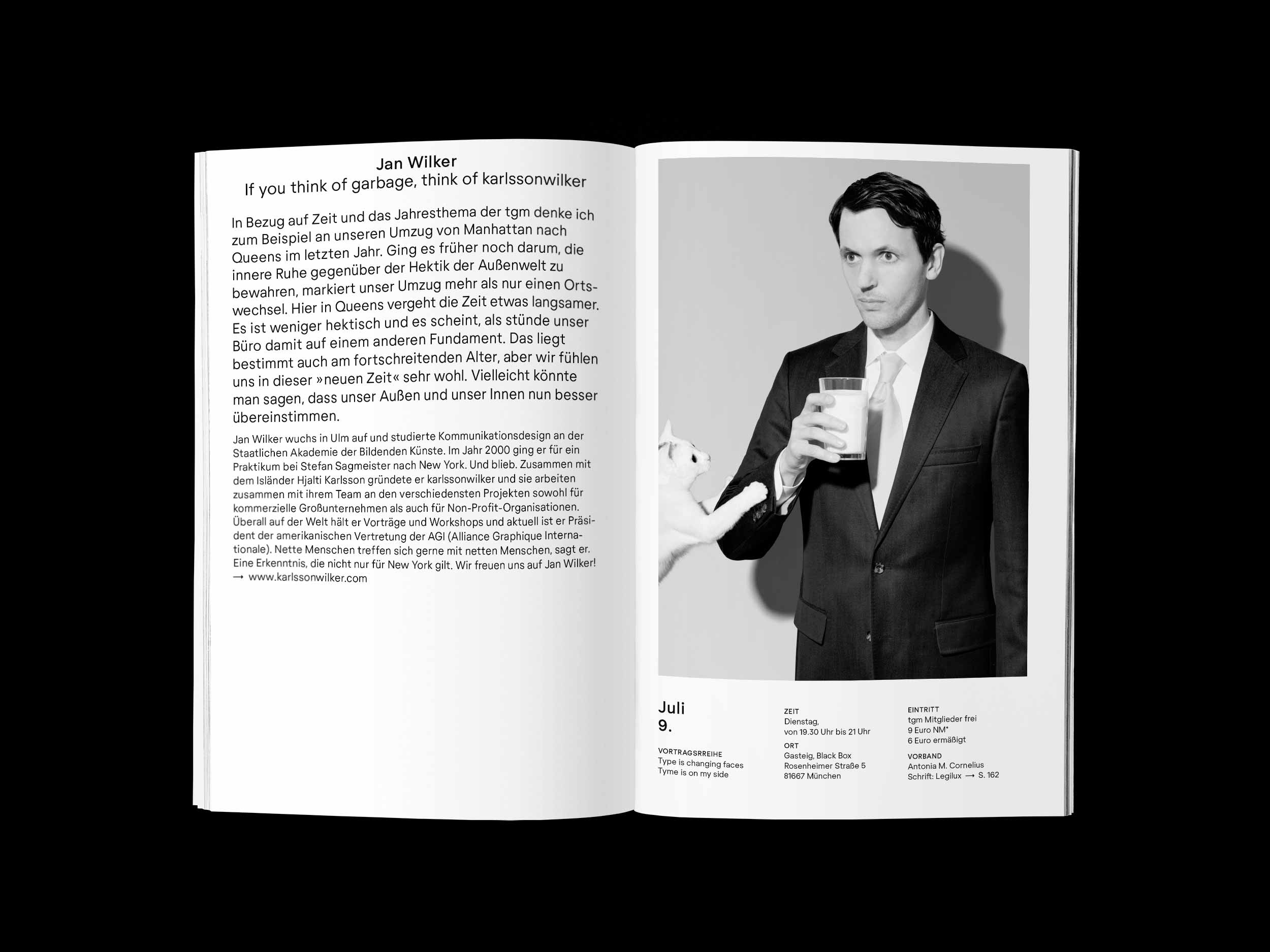
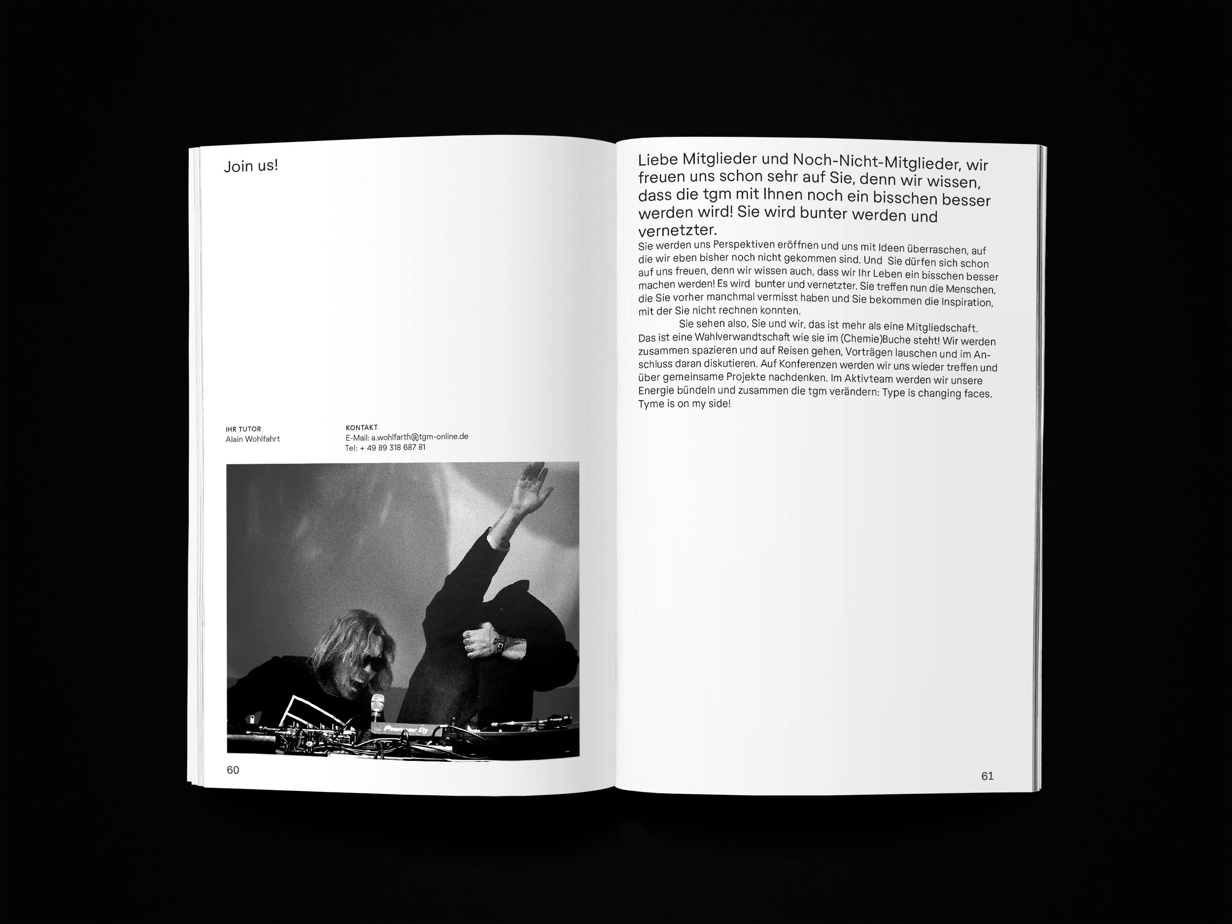
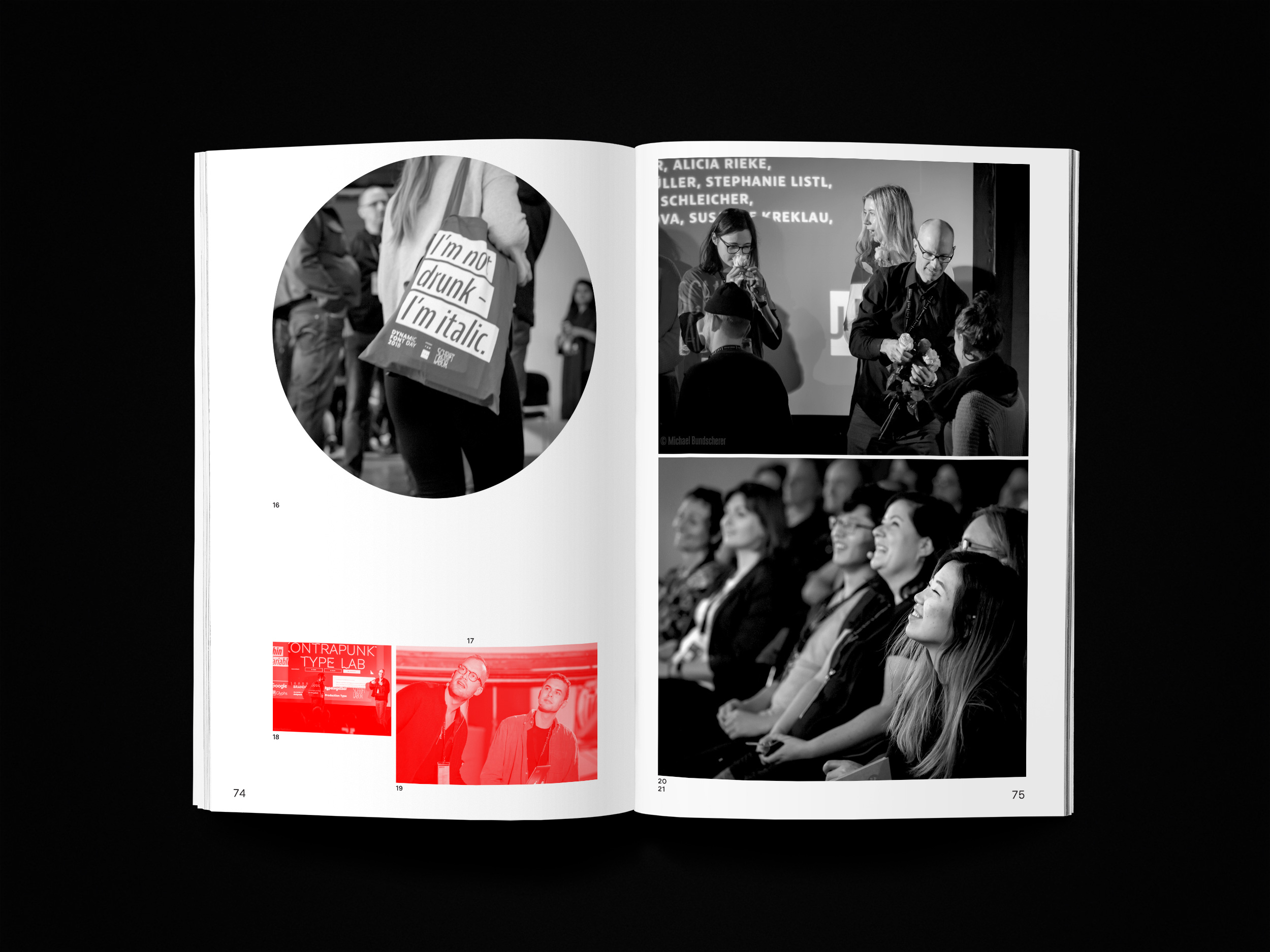
Photos: Dominik Parzinger
Type: Regola Pro @Studio ThinkWorkObserve